Python Use-Case Supervised ML/AI in Breast Cancer (BC) Classification

Introduction
Input Data
Let us download the dataset from Kaggle. It contains 596 rows and 33 columns of tumor shape and specifications. The tumor is classified as benign or malignant based on its geometry and shape. Features are computed from a digitized image of a fine needle aspirate (FNA) of a breast mass, which is type of biopsy procedure. They describe characteristics of the cell nuclei present in the image.
Features are computed from a digitized image of a fine needle aspirate (FNA) of a breast mass. They describe characteristics of the cell nuclei present in the image.
n the 3-dimensional space is that described in: [K. P. Bennett and O. L. Mangasarian: "Robust Linear Programming Discrimination of Two Linearly Inseparable Sets", Optimization Methods and Software 1, 1992, 23-34].
This database is also available through the UW CS ftp server:
ftp ftp.cs.wisc.edu
cd math-prog/cpo-dataset/machine-learn/WDBC/
Also can be found on UCI Machine Learning Repository: https://archive.ics.uci.edu/ml/datasets/Breast+Cancer+Wisconsin+%28Diagnostic%29
Attribute Information:
1) ID number
2) Diagnosis (M = malignant, B = benign)
3-32)
Ten real-valued features are computed for each cell nucleus:
a) radius (mean of distances from center to points on the perimeter)
b) texture (standard deviation of gray-scale values)
c) perimeter
d) area
e) smoothness (local variation in radius lengths)
f) compactness (perimeter^2 / area - 1.0)
g) concavity (severity of concave portions of the contour)
h) concave points (number of concave portions of the contour)
i) symmetry
j) fractal dimension ("coastline approximation" - 1)
The mean, standard error and "worst" or largest (mean of the three
largest values) of these features were computed for each image,
resulting in 30 features. For instance, field 3 is Mean Radius, field
13 is Radius SE, field 23 is Worst Radius.
All feature values are recoded with four significant digits.
Missing attribute values: none
Class distribution: 357 benign, 212 malignant.
#Step1: Importing all the necessary libraries
import pandas as pd
import numpy as np
import seaborn as sns
import matplotlib.pyplot as plt
#make a dataframe
df = pd.read_csv('C:/OneDrive/Documents/data.csv')
#examine the shape of the data
df.shape
(569, 33)
i.e. 63 and 37 %, respectively.
#get the column names
df.columns
Index(['id', 'diagnosis', 'radius_mean', 'texture_mean', 'perimeter_mean',
       'area_mean', 'smoothness_mean', 'compactness_mean', 'concavity_mean',
       'concave points_mean', 'symmetry_mean', 'fractal_dimension_mean',
       'radius_se', 'texture_se', 'perimeter_se', 'area_se', 'smoothness_se',
       'compactness_se', 'concavity_se', 'concave points_se', 'symmetry_se',
       'fractal_dimension_se', 'radius_worst', 'texture_worst',
       'perimeter_worst', 'area_worst', 'smoothness_worst',
       'compactness_worst', 'concavity_worst', 'concave points_worst',
       'symmetry_worst', 'fractal_dimension_worst', 'Unnamed: 32'],
      dtype='object')
#Drop the column with all missing values (na, NAN, NaN)
#NOTE: This drops the column Unnamed: 32 column
df = df.dropna(axis=1)
#Get a count of the number of 'M' & 'B' cells
df['diagnosis'].value_counts()
B    357
M    212
Name: diagnosis, dtype: int64
#Visualize this count
sns.countplot(df['diagnosis'],label="Count")

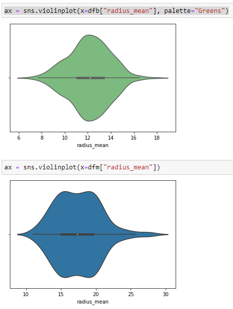
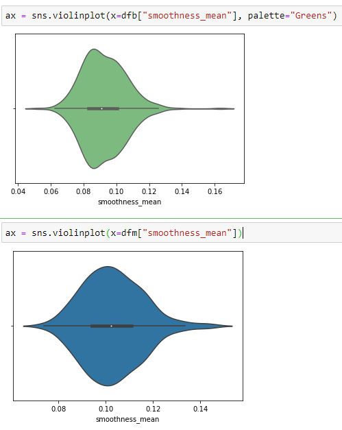
Violine Plots


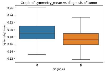
Box Plots


Correlation Matrix

Statistical Significance Test

Training ML Models
[0]Logistic Regression Training Accuracy: 0.9794721407624634
[1]Support Vector Machine (Linear Classifier) Training Accuracy: 0.9794721407624634
[2]Support Vector Machine (RBF Classifier) Training Accuracy: 0.9824046920821115
[3]Decision Tree Classifier Training Accuracy: 1.0
[4]Random Forest Classifier Training Accuracy: 0.9912023460410557
Error Analysis
[[142   1]
 [  2  83]]
Model[0] Testing Accuracy = "0.9868421052631579"
[[141   2]
 [  4  81]]
Model[1] Testing Accuracy = "0.9736842105263158"
[[141   2]
 [  3  82]]
Model[2] Testing Accuracy = "0.9780701754385965"
[[129  14]
 [  5  80]]
Model[3] Testing Accuracy = "0.9166666666666666"
[[139   4]
 [  6  79]]
Model[4] Testing Accuracy = "0.956140350877193"
Model  0
              precision    recall  f1-score   support

           0       0.99      0.99      0.99       143
           1       0.99      0.98      0.98        85

    accuracy                           0.99       228
   macro avg       0.99      0.98      0.99       228
weighted avg       0.99      0.99      0.99       228

0.9868421052631579
Model 1 precision recall f1-score support 0 0.97 0.99 0.98 143 1 0.98 0.95 0.96 85 accuracy 0.97 228 macro avg 0.97 0.97 0.97 228 weighted avg 0.97 0.97 0.97 228 0.9736842105263158Model 2 precision recall f1-score support 0 0.98 0.99 0.98 143 1 0.98 0.96 0.97 85 accuracy 0.98 228 macro avg 0.98 0.98 0.98 228 weighted avg 0.98 0.98 0.98 228 0.9780701754385965Model 3 precision recall f1-score support 0 0.96 0.90 0.93 143 1 0.85 0.94 0.89 85 accuracy 0.92 228 macro avg 0.91 0.92 0.91 228 weighted avg 0.92 0.92 0.92 228 0.9166666666666666 Model 4 precision recall f1-score support 0 0.96 0.97 0.97 143 1 0.95 0.93 0.94 85 accuracy 0.96 228 macro avg 0.96 0.95 0.95 228 weighted avg 0.96 0.96 0.96 228 0.956140350877193
HPO
Accuracy score 0.986842
              precision    recall  f1-score   support

           0       0.99      0.99      0.99       143
           1       0.99      0.98      0.98        85

    accuracy                           0.99       228
   macro avg       0.99      0.98      0.99       228
weighted avg       0.99      0.99      0.99       228

[[142   1]
 [  2  83]]
After grid searching the accuracy improved a little but the FNs are still 2.
Grid searching was done on SVC and Random Forest models too but the recall was best for logistic regression which is why the focus on logistic regression in this study.
Let's focus on the custom threshold to increase recall. The default threshold for interpreting probabilities to class labels is 0.5, and tuning this hyperparameter is called threshold moving.y_scores = best_model.predict_proba(X_test)[:, 1] from sklearn.metrics import precision_recall_curve p, r, thresholds = precision_recall_curve(y_test, y_scores)def adjusted_classes(y_scores, t): return [1 if y >= t else 0 for y in y_scores]def precision_recall_threshold(p, r, thresholds, t=0.5): y_pred_adj = adjusted_classes(y_scores, t) print(pd.DataFrame(confusion_matrix(y_test, y_pred_adj), columns=['pred_neg', 'pred_pos'], index=['neg', 'pos'])) print(classification_report(y_test, y_pred_adj))precision_recall_threshold(p, r, thresholds, 0.42)pred_neg pred_pos neg 141 2 pos 1 84 precision recall f1-score support 0 0.99 0.99 0.99 143 1 0.98 0.99 0.98 85 accuracy 0.99 228 macro avg 0.98 0.99 0.99 228 weighted avg 0.99 0.99 0.99 228Finally the FNs reduced to 1, after manually setting a decision threshold of 0.42!
Graph of recall and precision VS threshold
Recall scores as a function of the decision threshold are shown below.The line for optimal decision threshold 0.42 indicates the point of maximum recall which could be achieved without compromising a lot on precision. After that point the precision starts to drop more.Finally, we calculate the AUC scorefrom sklearn import metrics
from sklearn.metrics import roc_curve
# Compute predicted probabilities: y_pred_prob
y_pred_prob = best_model.predict_proba(X_test)[:,1]
# Generate ROC curve values: fpr, tpr, thresholds
fpr, tpr, thresholds = roc_curve(y_test, y_pred_prob)
print(metrics.auc(fpr, tpr))
# Plot ROC curve
#plt.plot([0, 1], [0, 1], 'k — ')
plt.plot(fpr, tpr)AUC=0.9979432332373509We plot the ROC curve for Logistic RegressionThat is TP Rate versus FP rate.AUC score tells us how good our model is at distinguishing between classes, in this case, predicting benign tumors as benign and malignant tumors as malignant.
The ROC curve is plotted with TPR against the FPR where TPR is on y-axis and FPR is on the x-axis. ROC curve looks almost ideal.
When the TPR and FPR don’t overlap at all, it means model has an ideal measure of separability ie it is able to correctly classify positives as positives and negatives as negatives.


Comments
Post a Comment